Maybe I'll figure this out later. I was really lucky getting this far. I would just type in random things into the html code on the template and try to put links to my art in different places... It just turned out like this:)
I like it better than it was before. One thing is I like the coloring better. Black and tan... I like green too, but this is more me. That is pretty much the coloring I use with my clothes and my room. Well, there's no black in my room. Doesn't matter.
Well, I do have another question. Which art do you think should go in the background?
1)
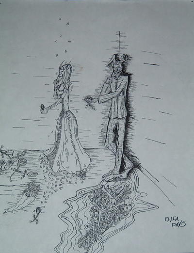 (The one that's up now... Obviously)
2)

3)
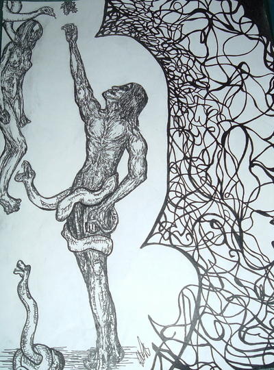
4)

5)

6)
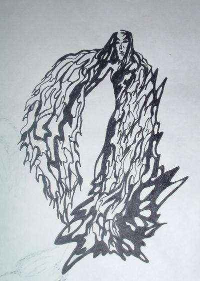
I am sticking with the black and white ones. I just like them best. So please let me know what you think! If you have any suggestions in general on how to make this site look better I'd love to know. As I mentioned before, I am really ignorant in this area.
Well, please comment or I will feel really stupid in asking for your opinion. Any help would be greatly appreciated even if it is, "I like #... better than what you have up now."
Thanks guys!
4 comments:
I like #2, but then you already knew that.
i like the sketches
I like what you are doing with your page. You can't really see the picture in the backround though, I can't anyway. Maybe you could sketch a border rather than putting a picture up. But if you want to go with one of these the one you have up is fine.
I really enjoy your art, you have a unique, abstract style in an age where everyone attempts to draw in an ultra-violent japanamation style (not that I have anything against ultra-violent Japanamation, I would just like to see some variety once in a blue moon). I also like how you've redesigned your blog site.
Post a Comment